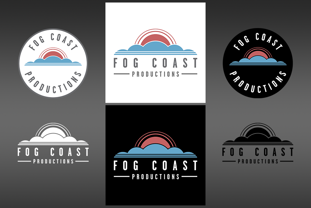
We’re thrilled to reveal our new logo! After many rounds of revisions and friends and family voting on different concepts, our team has put together a design that we feel is sleek, simple, modern, and emblematic of the Fog Coast name and brand.
Knowing how much storytelling is woven into the fabric of our company, it only makes sense that our logo has a story behind it as well. Below you will find the story behind our logo and the meaning behind it’s many elements.
But first, why?
The first question many people asked us when we told them we were re-designing our logo is: why? People love the original iconic logo with the Golden Gate Bridge, and we do too. However, while our company will always have roots in the city by the bay, we’ve grown to have clients and crew all over the world. This year alone we’ve worked with teams in Japan, London, China, Canada, and New Zealand to name a few. We wanted our brand to not be so tied to just San Francisco, but to symbolize a more global brand with imagery that represents growth, prosperity, and success.
A less sexy answer, and another factor that played into our decision, was the use of our logo in marketing materials, swag, animated elements etc. We learned the hard way that our original logo didn’t play nice in these areas. We simply had too many colors and intricate elements. We wanted a logo that could be easily printed and embroidered on t-shirts, jackets, sweatshirts, hats, and other forms of swag.
Every piece of our logo has meaning and purpose – below you will find the meaning behind the imagery and elements in our new logo!
> The blue lines in our logo represent water and the “coast” in the Fog Coast name. We chose straight lines to represent the coastline and marine layer that sits beneath the fog. The double blue lines also represent the two main service lines that our company was founded on; live action video, and animation.
> The blue clouds represent the fog above the coastline. At the time of creating this logo we are entering our 5th year in business. The five points on the cloud represent our five years as a company.
> We removed the Golden Gate Bridge and replaced it with the sun. While we are a San Francisco based company, we’ve grown to serve customers all over the world. The sun represents a new horizon and symbolizes a more global brand that represents growth, prosperity, and success.
>The two lines around the sun are another nod to our two flagship service lines, live action video and animation.
> We kept our signature “garage gothic” text from our original logo, paying respect to our past as we charge forward to the future.
Written By: Andrew Klein, Executive Producer, Fog Coast Productions


